OVERVIEW
BACKGROUND
Methodologies
Contextual interviews
Task‑focused surveys
Competitive analysis
Empathy mapping & affinity clustering
Wireframing & Prototyping
Tools
Figma
Microsoft Office
Timeline
2 months
How It All Started
In a fast-paced clinical environment, efficiency and clear visibility into workflow are essential for a good user experience. To support this, LigoLab set out to design a feature that would make it easier for clinicians to track their progress through key tasks.
The idea behind the "Progress Battery" was to provide a simple, visual way for users to see where they were in their workflow at a glance, helping them stay organized, reduce cognitive load, and complete their work more efficiently.
Problem
LigoLab users struggle with a lack of progress tracking, causing inefficiencies and frustration as they manually track task status across multiple screens.
Goal
Design and implement a progress bar in LigoLab to enable users to easily track task completion and improve workflow efficiency.
Steps Conducted
Outlined Research Goals
Ran a Competitive Analysis
Interviewed Clinicians
Mapped User Insights with Empathy Mapping
Identified Pain Points and User Needs
Developed User Personas and Value Propositions
Created Wireframes and Prototypes
To make sure the Progress Battery really worked for clinicians, I blended insights from competitor research with what we heard directly from users.
Staying close to real workflows and needs helped us design something that felt intuitive, useful, and easy to adopt in a fast-paced environment. Now that you know the setup, let’s jump into the process.

FOUNDATIONAL RESEARCH
Participant Screening Criteria
Active LigoLab users for ≥ 3 months
Mix of roles: clinicians, lab managers, QA
Active users of LigoLab who rely on the search function for daily tasks (like looking up patient cases, specimen IDs, reports)
Mix of beginner and advanced users
Users with varying typing styles, terminology familiarity, and comfort with filtering options
Research Goals
Understand how users currently manage and track progress during multi-step or time-sensitive tasks in LigoLab's platform.
Identify user frustrations or confusion that arise from the lack of visible task progress.
Explore what users expect from a progress indicator—what information it should convey, and how it could support their decision-making during tasks.
1.1 Competitive Analysis
To understand how other systems visualize progress and case tracking, we conducted a competitive analysis of 7 lab and workflow-related platforms. We examined how each tool communicates task status, time estimates, and user responsibilities.
Key points of analysis included: visibility of task progress, use of visual indicators, and time transparency.
These findings revealed gaps in LigoLab’s current experience and inspired early ideas for a clearer, progress-focused interface.


1.2 User Interviews
We interviewed 9 internal LigoLab users across various roles, including lab technicians, admin assistants, pathologists, and QA analysts.
The goal was to uncover workflow frustrations and understand needs around case visibility and progress tracking. These insights helped validate the demand for clearer progress indicators and informed early design directions.
SYNTHESIZING INSIGHTS
2.1 User Insights
I synthesized interview findings into four core categories: Says, Thinks, Does, and Feels, to build a clearer picture of our users’ experience. This empathy map helped surface patterns in behaviors, frustrations, and expectations, forming a strong foundation for identifying pain points and guiding our design direction.
Says
Does
Thinks
Feels
2.2 Empathy Mapping
DELIVERABLES
3.1 User Pain Points
Through interviews and empathy mapping, I uncovered recurring frustrations across different roles. I grouped these insights into key pain points that reflect gaps in visibility, feedback, and workflow clarity.
These challenges not only slow users down but also add unnecessary cognitive strain—highlighting a clear opportunity for thoughtful, progress-oriented design solutions.
Lack of task visibility
Users can’t easily tell how far along they are in completing their tasks (e.g., signing in/out cases), leading to inefficiencies and repeated checks.
No centralized progress tracking
Progress-related information is scattered across multiple screens or modules, making it time-consuming to find and compile status updates.
Uncertainty during processing stages
Users are unsure whether a task is in progress, delayed, or stuck, especially during specimen collection and lab processing.
Inability to estimate or monitor time spent
Users have no clear way to see how much time a process or stage is taking, which limits their ability to optimize workflows or prioritize.
Mental burden of self-tracking
Many users rely on memory or manual effort to track task completion, which leads to cognitive overload and room for error.
Lack of feedback creates frustration
The system provides minimal visual or real-time feedback during workflows, which leaves users feeling uncertain and disconnected from task progress.
Increased reliance on workaround behaviors
Some users create their own tracking systems or repeatedly check logs and timestamps to make up for the lack of visual indicators.
3.1 User Personas
Based on the research, I created user personas to represent the diverse needs and pain points of the target users. These personas helped guide design decisions, build empathy, and stress-test solutions to ensure they addressed real user challenges.

3.3 Value Propositions

IDEATION
4.1 Wireframing
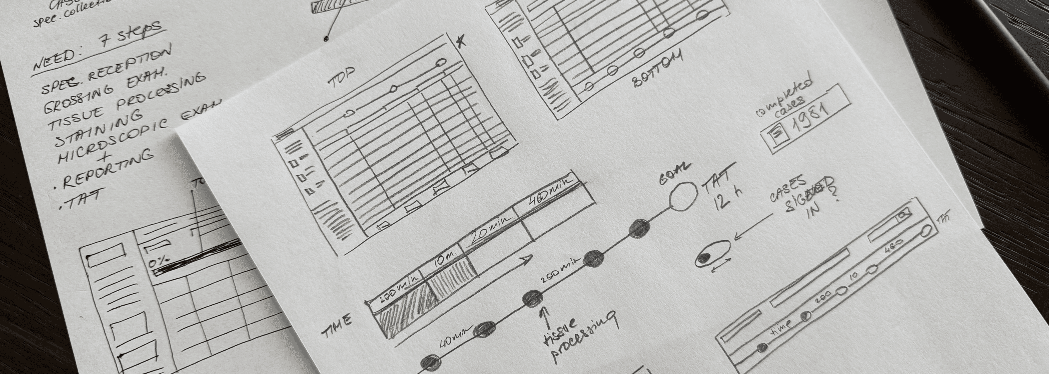
After synthesizing the research and sketching initial ideas on paper, I moved on to creating low-fidelity wireframes.
This helped me visualize the structure, test user flows, and gave the design team a clear direction grounded in user needs.
4.2 Prototype
After developing low-fidelity wireframes and validating the main flows, we put together a prototype to bring the concept to life.
This allowed us to test real user interactions, catch usability issues early, and communicate the experience more clearly with the team. It also made feedback cycles faster, helping us stay aligned with both stakeholder goals and user expectations.
We’re still in the final stages of development, so I can’t share the high-fidelity prototype yet, but here’s a sneak peek of the work so far.

The user research helped prioritize the most relevant data and steps clinicians wanted to track. By conducting interviews, I identified key needs, such as focusing on processed cases over others, and translated these into a clear, visual mockup.
The feedback gathered ensured the feature would be user-centered and intuitive, significantly improving how clinicians track and manage their work. This research demonstrated the value of involving users early in feature development to align functionality with actual user needs.
Conclusions
Learnings
This project taught me how important it is to really listen to users and understand their workflows. By conducting interviews and using affinity mapping, I was able to uncover key pain points and turn them into clear, actionable insights.
I also realized how vital it is to keep everyone, from stakeholders to team members, aligned so we’re all focused on solving the right problems.
What went well
Collaborative design. Involving clinicians and the design team from the start helped ensure the feature truly met user needs. It made the design feel natural and aligned with their workflows.
Quick feedback cycles. Using lightweight prototypes early on allowed us to gather fast feedback, refine ideas quickly, and avoid wasted time in development.
User-focused priorities. Keeping the focus on user personas and real pain points helped us prioritize what would make the biggest impact, ensuring we tackled the most important features first.
What I’d improve next time
Real-time feedback. While we did testing in phases, getting more real-time feedback from users in their everyday environments would offer deeper insights into how the feature performs during actual use.
Broader team input. In the future, I’d bring in more team members from clinical operations or support roles earlier on. Their perspectives could help spot gaps before development begins.
Diverse testing scenarios. I’d test across different devices and environments, like mobile use during shifts, to ensure the feature works well in real-world, high-pressure situations.
Building the Progress Bar:
Improving Workflow Visibility in Healthtech Software
Making search smarter, simpler, and seamless
As part of LigoLab's effort to introduce the 'Progress Battery' feature into its laboratory information system platform, I conducted user research to determine the most important steps and data clinicians wanted to track.
This research involved interviewing users to understand their needs, identifying key features for the progress tracker, and creating a mockup that visually represented these priorities. The goal was to ensure the feature was both intuitive and aligned with clinician workflows.

Want to connect?
Let’s discuss how I can contribute to bringing your user experience to a new level.
Contact me
Want to connect?
Let’s discuss how I can contribute to bringing your user experience to a new level.
Contact me
BACKGROUND

“Am I falling behind or staying on track?”
“There has to be a better way to know where I am in the process.”
“If I could see where time is being spent, I could improve my workflow.”
“I’m not sure if I’ve done everything I need to.”
Thinks
Says
“I want to see how many cases I’ve signed in.”
“I’d love a simple view of my overall progress.”
“It would be helpful to know how long specimen collection takes.”
“Sometimes I don’t know if something is processing or stuck.”
Clicks through multiple screens to track case status.
Manually counts or estimates completed work.
Relies on memory or notes to gauge progress.
Checks timestamps and logs to figure out duration manually.
Does
Frustrated by lack of visibility and feedback.
Anxious about missing steps or delays.
Uncertain about task status or system performance.
Overwhelmed when juggling multiple cases.
Feels
2.2 Empathy Mapping
Lack of task visibility
Users can’t easily tell how far along they are in completing their tasks (e.g., signing in/out cases), leading to inefficiencies and repeated checks.
No centralized progress tracking
Progress-related information is scattered across multiple screens or modules, making it time-consuming to find and compile status updates.
Uncertainty during processing stages
Users are unsure whether a task is in progress, delayed, or stuck, especially during specimen collection and lab processing.
Inability to estimate or monitor time spent
Users have no clear way to see how much time a process or stage is taking, which limits their ability to optimize workflows or prioritize.
Mental burden of self-tracking
Many users rely on memory or manual effort to track task completion, which leads to cognitive overload and room for error.
Lack of feedback creates frustration
The system provides minimal visual or real-time feedback during workflows, which leaves users feeling uncertain and disconnected from task progress.
Increased reliance on workaround behaviors
Some users create their own tracking systems or repeatedly check logs and timestamps to make up for the lack of visual indicators.
3.3 Value Propositions
Participant Screening Criteria
Active LigoLab users for ≥ 3 months
Mix of roles: clinicians, lab managers, QA
Active users of LigoLab who rely on the search function for daily tasks (like looking up patient cases, specimen IDs, reports)
Mix of beginner and advanced users
Users with varying typing styles, terminology familiarity, and comfort with filtering options
Research Goals
Understand how users currently manage and track progress during multi-step or time-sensitive tasks in LigoLab's platform.
Identify user frustrations or confusion that arise from the lack of visible task progress.
Explore what users expect from a progress indicator—what information it should convey, and how it could support their decision-making during tasks.
To understand how other systems visualize progress and case tracking, we conducted a competitive analysis of 7 lab and workflow-related platforms. We examined how each tool communicates task status, time estimates, and user responsibilities. Key points of analysis included: visibility of task progress, use of visual indicators, and time transparency. These findings revealed gaps in LigoLab’s current experience and inspired early ideas for a clearer, progress-focused interface.
1.1 Competitive Analysis
We interviewed 9 internal LigoLab users across various roles, including lab technicians, admin assistants, pathologists, and QA analysts. The goal was to uncover workflow frustrations and understand needs around case visibility and progress tracking. These insights helped validate the demand for clearer progress indicators and informed early design directions.
1.2 User Interviews
2. SYNTHESIZING INSIGHTS
3. DELIVERABLES
2.1 User Insights
I synthesized interview findings into four core categories: Says, Thinks, Does, and Feels, to build a clearer picture of our users’ experience. This empathy map helped surface patterns in behaviors, frustrations, and expectations, forming a strong foundation for identifying pain points and guiding our design direction.
Says
Does
Thinks
Feels
3.1 User Pain Points
Through interviews and empathy mapping, I uncovered recurring frustrations across different roles. I grouped these insights into key pain points that reflect gaps in visibility, feedback, and workflow clarity. These challenges not only slow users down but also add unnecessary cognitive strain—highlighting a clear opportunity for thoughtful, progress-oriented design solutions.
3.1 User Personas
Based on the research, I created user personas to represent the diverse needs and pain points of the target users. These personas helped guide design decisions, build empathy, and stress-test solutions to ensure they addressed real user challenges.
Clear Task Visibility
Time Saving
Confidence and Control
Enhanced UX
Improved Accuracy
Provide real-time feedback on task progress, so users always know where they stand.
Reduce the need for manual tracking, streamlining workflows
Minimize human error by offering an intuitive, easy-to-follow progress tracker.
Simplify task tracking with a single, easy-to-read progress bar that reduces cognitive load.
Give users a visual indicator of progress, boosting confidence & helping them prioritize effectively.
4. IDEATION
4.1 Wireframing
After synthesizing the research and sketching initial ideas on paper, I moved on to creating low-fidelity wireframes. This helped me visualize the structure, test user flows, and gave the design team a clear direction grounded in user needs.
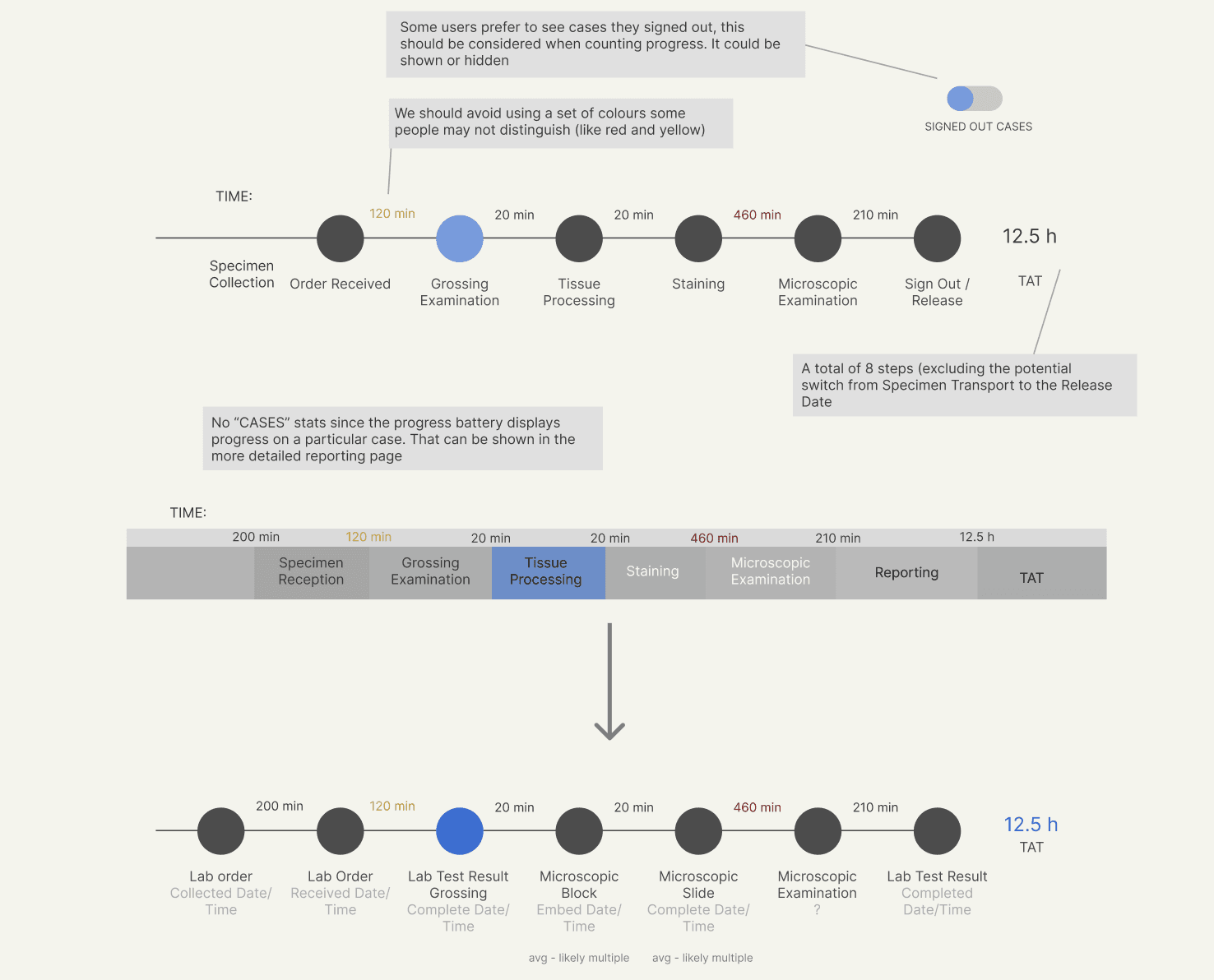
Order Received
Staining
Tissue Processing
Sign Out / Release
Microscopic Examination
Grossing Examination
TAT
No “CASES” stats since the progress battery displays progress on a particular case. That can be shown in the more detailed reporting page
Some users prefer to see cases they signed out, this should be considered when counting progress. It could be shown or hidden
We should avoid using a set of colours some people may not distinguish (like red and yellow)
A total of 8 steps (excluding the potential switch from Specimen Transport to the Release Date
120 min
210 min
12.5 h
460 min
20 min
20 min
SIGNED OUT CASES
Lab order
Collected Date/Time
Lab Order
Received Date/Time
Microscopic Slide
Complete Date/Time
Microscopic Block
Embed Date/Time
avg - likely multiple
avg - likely multiple
Lab Test Result Completed
Date/Time
Microscopic Examination
?
Lab Test Result Grossing
Complete Date/Time
TAT
TIME:
200 min
120 min
210 min
12.5 h
460 min
20 min
20 min
Specimen Collection
Specimen Reception
Staining
Tissue Processing
Reporting
Microscopic Examination
Grossing Examination
TAT
TIME:
200 min
120 min
210 min
12.5 h
460 min
20 min
20 min
Process
Below is a visual overview of the design process through the ideation phase. Like most real-world projects, this was not a strictly linear path—it was an iterative and evolving journey where I often revisited earlier steps to refine and align solutions with user needs.
Review Research
Sketch Ideas
Lo-Fi Wireframe
Validation Testing
Hi-Fi Prototype
4.2 Prototype
After developing low-fidelity wireframes and validating the main flows, we put together a prototype to bring the concept to life. This allowed us to test real user interactions, catch usability issues early, and communicate the experience more clearly with the team. It also made feedback cycles faster, helping us stay aligned with both stakeholder goals and user expectations.
We’re still in the final stages of development, so I can’t share the high-fidelity prototype yet, but here’s a sneak peek of the work so far.
Conclusions
The user research helped prioritize the most relevant data and steps clinicians wanted to track. By conducting interviews, I identified key needs, such as focusing on processed cases over others, and translated these into a clear, visual mockup.
The feedback gathered ensured the feature would be user-centered and intuitive, significantly improving how clinicians track and manage their work. This research demonstrated the value of involving users early in feature development to align functionality with actual user needs.
As part of LigoLab's effort to introduce the 'Progress Battery' feature into its laboratory information system platform, I conducted user research to determine the most important steps and data clinicians wanted to track.
This research involved interviewing users to understand their needs, identifying key features for the progress tracker, and creating a mockup that visually represented these priorities. The goal was to ensure the feature was both intuitive and aligned with clinician workflows.
Making search smarter, simpler, and seamless
OVERVIEW
Methodologies
Contextual interviews
Task‑focused surveys
Competitive analysis
Empathy mapping & affinity clustering
Wireframing & Prototyping
Tools
Figma / Microsoft Office
Timeline
2 months
Building the Progress Bar: Improving Workflow Visibility in Healthtech Software
How It All Started
In a fast-paced clinical environment, efficiency and clear visibility into workflow are essential for a good user experience. To support this, LigoLab set out to design a feature that would make it easier for clinicians to track their progress through key tasks.
The idea behind the "Progress Battery" was to provide a simple, visual way for users to see where they were in their workflow at a glance, helping them stay organized, reduce cognitive load, and complete their work more efficiently.
Steps Conducted
Outlined Research Goals
Ran a Competitive Analysis
Interviewed Clinicians
Mapped User Insights with Empathy Mapping
Identified Pain Points and User Needs
Developed User Personas and Value Propositions
Created Wireframes and Prototypes
To make sure the Progress Battery really worked for clinicians, I blended insights from competitor research with what we heard directly from users. Staying close to real workflows and needs helped us design something that felt intuitive, useful, and easy to adopt in a fast-paced environment. Now that you know the setup, let’s jump into the process.
Problem
LigoLab users struggle with a lack of progress tracking, causing inefficiencies and frustration as they manually track task status across multiple screens.
Goal
Design and implement a progress bar in LigoLab to enable users to easily track task completion and improve workflow efficiency.
1. FOUNDATIONAL RESEARCH
Learnings
This project taught me how important it is to really listen to users and understand their workflows. By conducting interviews and using affinity mapping, I was able to uncover key pain points and turn them into clear, actionable insights. I also realized how vital it is to keep everyone, from stakeholders to team members, aligned so we’re all focused on solving the right problems.
What went well
Collaborative design. Involving clinicians and the design team from the start helped ensure the feature truly met user needs. It made the design feel natural and aligned with their workflows.
Quick feedback cycles. Using lightweight prototypes early on allowed us to gather fast feedback, refine ideas quickly, and avoid wasted time in development.
User-focused priorities. Keeping the focus on user personas and real pain points helped us prioritize what would make the biggest impact, ensuring we tackled the most important features first.
What I’d improve next time
Real-time feedback. While we did testing in phases, getting more real-time feedback from users in their everyday environments would offer deeper insights into how the feature performs during actual use.
Broader team input. In the future, I’d bring in more team members from clinical operations or support roles earlier on. Their perspectives could help spot gaps before development begins.
Diverse testing scenarios. I’d test across different devices and environments, like mobile use during shifts, to ensure the feature works well in real-world, high-pressure situations.
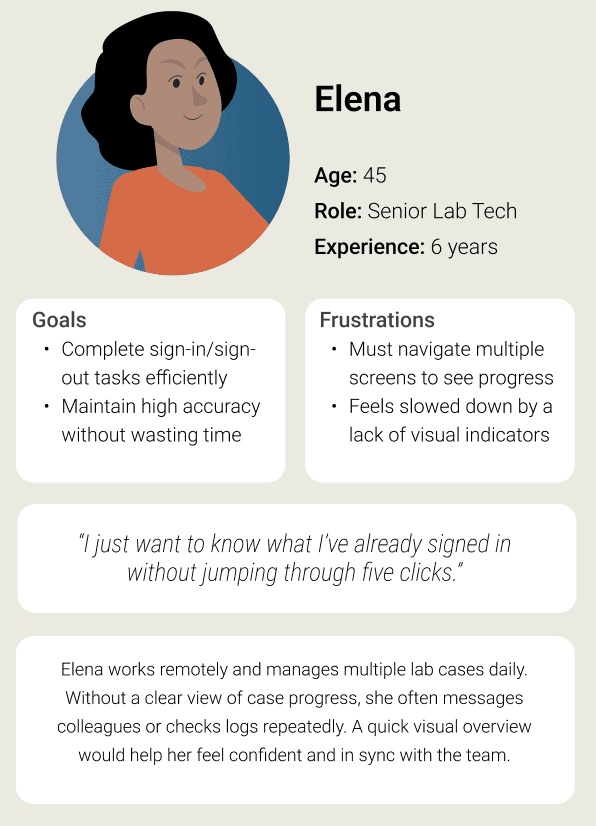
Elena
Age: 45
Role: Senior Lab Tech
Experience: 6 years
Frustrations
Must navigate multiple screens to see progress
Feels slowed down by a lack of visual indicators
Goals
Complete sign-in/sign-out tasks efficiently
Maintain high accuracy without wasting time
“I just want to know what I’ve already signed in without jumping through five clicks.”
Elena works remotely and manages multiple lab cases daily. Without a clear view of case progress, she often messages colleagues or checks logs repeatedly. A quick visual overview would help her feel confident and in sync with the team.
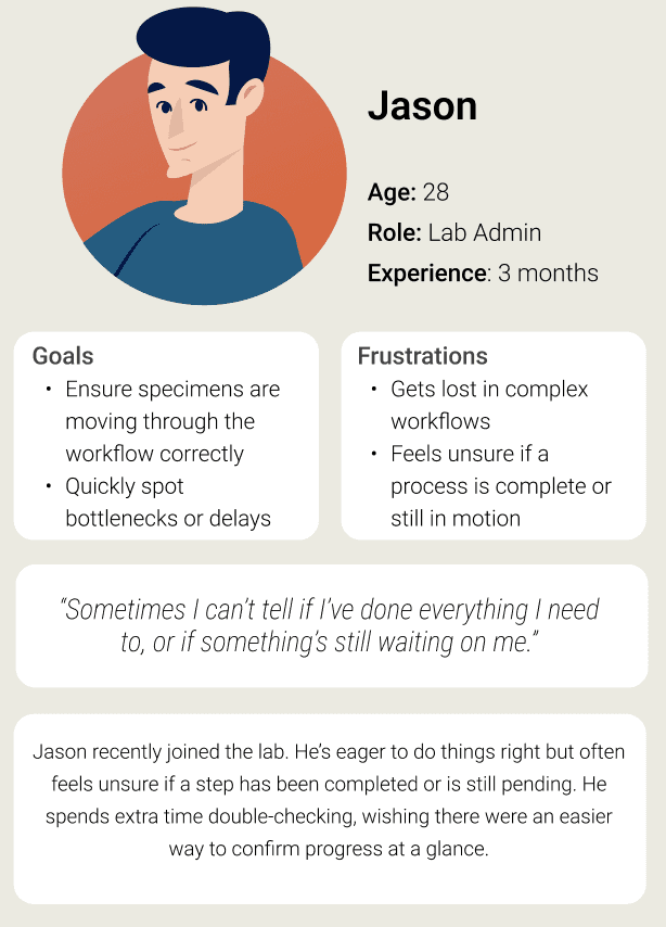
Jason
Age: 28
Role: Lab Admin
Experience: 3 months
Frustrations
Gets lost in complex workflows
Feels unsure if a process is complete or still in motion
Goals
Ensure specimens are moving through the workflow correctly
Quickly spot bottlenecks or delays
“Sometimes I can’t tell if I’ve done everything I need to, or if something’s still waiting on me.”
Jason recently joined the lab. He’s eager to do things right but often feels unsure if a step has been completed or is still pending. He spends extra time double-checking, wishing there were an easier way to confirm progress at a glance.
Karim
Age: 51
Role: Pathologist
Experience: 4 years
Frustrations
Has to rely on others for workflow updates
Lacks visibility into how long cases have been pending
“If I knew how long a case has been sitting in the system, I could act faster and more strategically.”
Goals
Prioritize urgent cases
Get an overview of where cases are in the process
Dr. Karim works in a fast-paced hospital setting. He needs to triage cases efficiently but often lacks visibility into their status. Without knowing how long something’s been pending, he risks delays - something a quick, clear progress view could help prevent.
Want to connect?
Let’s discuss how I can contribute to bringing your user experience to a new level.
Contact me