Optimizing Template Showcases
OVERVIEW
Methodologies
Contextual interviews
Task‑focused surveys
Competitive analysis
Empathy mapping & affinity clustering
Prototyping
Tools
Figma
Miro
Microsoft Office
Timeline
3 months
BACKGROUND
How It All Started
Lab staff were spending valuable minutes poking around screens for the right record instead of moving cases forward.
That pain point kicked off an SEO‑style research sprint focused on our own search: mapping the exact terms clinicians use, studying how other lab platforms surface results, and prototyping smarter filters and ranking logic.
Problem
Profi users struggle with time-consuming document creation, lack of customizable templates, and inefficient workflows, leading to frustration and lost productivity.
Goal
Develop a versatile and intuitive template showcase that supports a variety of content needs across coaching, consulting, and therapy, while offering the ability to personalize and customize each template for unique client scenarios.
Steps Conducted
Outlined Research Objectives
Conducted a Competitive Audit
Collected User Insights
Synthesized Findings
Developed User Personas and Value Propositions
Shared Actionable Recommendations
Along the way, I made sure we stayed anchored in real user needs, not just guesses. By blending user feedback with competitor insights, we were able to spot what really mattered, prioritize the right improvements, and set up a solid starting point for design.
FOUNDATIONAL RESEARCH
Participant Screening Criteria
Age: 25–55
Coaches, consultants, and therapists across various industries
Active users of Profi who regularly create and manage client-facing documents, plans, and other materials
Users with varying levels of technical skill (from beginner to advanced)
Users who have diverse preferences for structure, style, and customization in their materials
Research Goals
Understand how users currently create and customize client-facing documents without templates and the pain points in that process.
Identify user needs for template customization and flexibility.
Define the expectations users have for a template showcase, including template structure, content type, and customization features.
1.1 Competitive Analysis
I analyzed how competing platforms showcased templates and organized workflows, looking for patterns, strengths, and missed opportunities.
This research highlighted best practices like clear navigation, smart filtering, and customization options, as well as common friction points.

1.2 User Interviews
We interviewed 19 Profi users, including coaches, consultants, and therapists, to better understand their needs and pain points when it comes to templates. Our aim was to find out what they struggle with and what would make their workflows smoother.
Through the interviews, we learned that users wanted easy access to template previews, a simpler way to organize templates, and more flexibility to customize them for different use cases.
SYNTHESIZING FINDINGS
Once I had all the user feedback, I organized it to spot patterns, highlight key pain points, and identify where users were struggling. From there, I built user personas to capture the different needs, goals, and frustrations we were seeing.
These personas helped the team stay focused on who we were designing for and guided decisions that were grounded in real user experiences.
2.1 User Insights
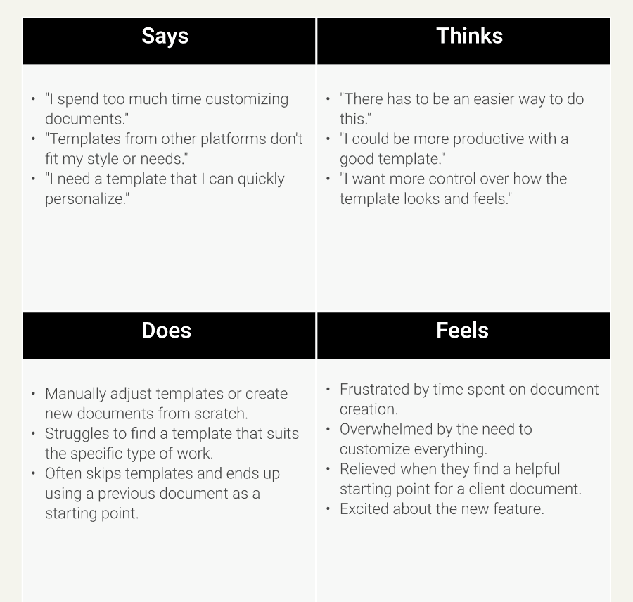
We synthesized our interview findings into four core categories: Says, Thinks, Does, and Feels - to build a clearer picture of our users’ experience.
This empathy map helped surface patterns in behaviors, frustrations, and expectations, forming a strong foundation for identifying pain points and guiding our design direction.
Says
Does
Thinks
Feels
2.2 Empathy Mapping
DELIVERABLES
The project deliverables included a report summarizing key insights from user interviews and task analysis, user personas to represent our target audience, and a list of pain points and opportunities.
These outputs helped to translate user needs into actionable steps for the design team. Our team then used these deliverables to inform the prototyping phase.
By aligning on the personas, pain points, and opportunities, we were able to design with a clear focus on user needs.
3.1 User Pain Points
Through interviews and empathy mapping, I uncovered recurring frustrations across different roles. I grouped these insights into key pain points that reflect gaps in visibility, feedback, and workflow clarity.
These challenges not only slow users down but also add unnecessary cognitive strain, highlighting a clear opportunity for thoughtful, progress-oriented design solutions.
Limited Template Flexibility
Existing templates are too rigid and don’t allow for enough customization to suit individual client needs.
Users often find themselves starting from scratch or modifying unsuitable templates.
Time-Consuming Content Creation
Without ready-made templates, users spend excessive time creating client-facing documents from the ground up.
Users feel that time spent on document creation takes away from their ability to focus on actual coaching or consulting.
Lack of Structure or Guidance
Many users are unsure about the best format or structure for client-facing materials, leading to inconsistent outcomes.
Users need more clarity on what type of content works best for different types of sessions.
Inconsistent Use of Templates
Users who have used templates in other tools find them difficult to adapt to their own needs, leading to frustration and inefficiency.
There is no clear understanding of how to effectively apply a template for different scenarios (e.g., therapy sessions vs. business coaching).
Customization Needs
Users want flexibility to change text, design, and structure while keeping the overall template framework intact.
Lack of dynamic elements (like editable text blocks) within templates.
3.2 User Personas
Based on the research, I created user personas to represent the diverse needs and pain points of the target users.
These personas helped guide design decisions, build empathy, and stress-test solutions to ensure they addressed real user challenges.


3.3 Value Propositions
IDEATION
Process
Below is a visual overview of the design process through the ideation phase. Like most real-world projects, this was not a strictly linear path; it was an iterative and evolving journey where I often revisited earlier steps to refine and align solutions with user needs.

4.1 Prototype
After defining key features and refining user flows based on research, we developed low-fidelity wireframes to visualize the structure of the template showcase.
This allowed us to explore different layout options, streamline the user journey, and ensure that key pain points were addressed.
The wireframes served as a foundation for team discussions, enabling quicker iterations and clearer communication of design intent before moving to more refined prototypes.

Learnings
Working on this project really showed me how important it is to dig into how users actually work before thinking about design solutions.
Talking to users uncovered needs and frustrations we wouldn’t have spotted otherwise. Creating personas and mapping pain points gave everyone on the team a clear picture to design around, which kept us aligned.
Overall, this project was a great reminder that strong research early on makes the whole design process smoother and way more focused.
What went well
Grounded insights. Combining competitor analysis with user interviews helped us spot both gaps in the market and real user needs.
Personas built alignment. Creating clear user personas early made it easier for the design team to stay focused on user goals throughout prototyping.
Stakeholder buy-in. Regular research check-ins kept the team aligned and made it easier to get quick approval on design iterations.
What I’d improve next time
Wider participant pool. I’d include users from more industries and experience levels to capture a broader range of workflows.
Earlier testing cycles. Building low-fidelity prototypes sooner could catch usability issues earlier and speed up design refinements.
Deeper workflow validation. Adding a task-based usability study before moving into high-fidelity designs would help validate flow efficiency.
Conclusions
The research provided valuable insights into how users interacted with template showcases, revealing key pain points and opportunities for optimization.
By analyzing competitor workflows, I identified a more efficient approach to displaying templates, reducing the number of clicks and task duration for users.
The resulting design recommendations helped refine the user journey, ensuring a smoother and more intuitive experience that better aligned with user expectations.
This research underscored the importance of balancing visual design with task efficiency to enhance overall usability.
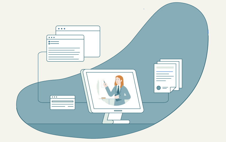
At Profi, a platform that helps service professionals manage and grow their client work, I led foundational research to support the design of the new "Templates" feature. I focused on understanding how users worked, what they needed, and where they were getting stuck, using interviews and task analysis to guide the way.
During that process, I uncovered key pain points, expectations, and areas for improvement. This research helped shape an intuitive and efficient template showcase, making sure it fit naturally into users’ workflows and made their experience smoother.
Enhancing user journeys and feature design at Profi
Want to connect?
Let’s discuss how I can contribute to bringing your user experience to a new level.
Contact me
Want to connect?
Let’s discuss how I can contribute to bringing your user experience to a new level.
Contact me
1. FOUNDATIONAL RESEARCH

"There has to be an easier way to do this."
"I could be more productive with a good template."
"I want more control over how the template looks and feels."
Thinks
Says
"I spend too much time customizing documents."
"Templates from other platforms don't fit my style or needs."
"I need a template that I can quickly personalize."
Manually adjust templates or create new documents from scratch.
Struggles to find a template that suits the specific type of work.
Often skips templates and ends up using a previous document as a starting point.
Does
Frustrated by time spent on document creation.
Overwhelmed by the need to customize everything.
Relieved when they find a helpful starting point for a client document.
Excited about the new feature.
Feels
2.2 Empathy Mapping
Limited Template Flexibility
Existing templates are too rigid and don’t allow for enough customization to suit individual client needs.
Users often find themselves starting from scratch or modifying unsuitable templates.
Time-Consuming Content Creation
Without ready-made templates, users spend excessive time creating client-facing documents from the ground up.
Users feel that time spent on document creation takes away from their ability to focus on actual coaching or consulting.
Lack of Structure or Guidance
Many users are unsure about the best format or structure for client-facing materials, leading to inconsistent outcomes.
Users need more clarity on what type of content works best for different types of sessions.
Inconsistent Use of Templates
Users who have used templates in other tools find them difficult to adapt to their own needs, leading to frustration and inefficiency.
There is no clear understanding of how to effectively apply a template for different scenarios (such as therapy sessions vs. business coaching).
Customization Needs
Users want flexibility to change text, design, and structure while keeping the overall template framework intact.
Lack of dynamic elements (like editable text blocks) within templates.
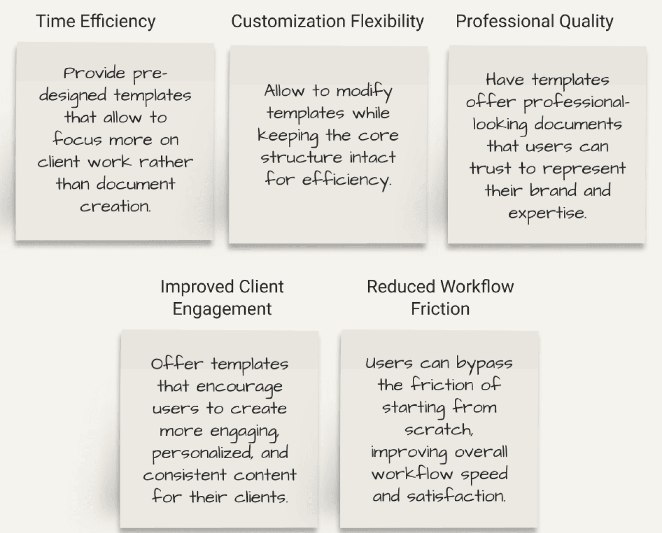
3.3 Value Propositions
Participant Screening Criteria
Active Profi users for ≥ 2 months
Coaches, consultants, and therapists across various industries
Active users of Profi who regularly create and manage client-facing documents, plans, and other materials
Users with varying levels of technical skill (from beginner to advanced)
Users who have diverse preferences for structure, style, and customization in their materials
Research Goals
Understand how users currently create and customize client-facing documents without templates and the pain points in that process.
Identify user needs for template customization and flexibility.
Define the expectations users have for a template showcase, including template structure, content type, and customization features.
I analyzed how competing platforms showcased templates and organized workflows, looking for patterns, strengths, and missed opportunities. This research highlighted best practices like clear navigation, smart filtering, and customization options, as well as common friction points.
1.1 Competitive Analysis
We interviewed 19 Profi users, including coaches, consultants, and therapists, to better understand their needs and pain points when it comes to templates. Our aim was to find out what they struggle with and what would make their workflows smoother. Through the interviews, we learned that users wanted easy access to template previews, a simpler way to organize templates, and more flexibility to customize them for different use cases.
1.2 User Interviews
2. SYNTHESIZING FINDINGS
2.1 User Insights
We synthesized our interview findings into four core categories: Says, Thinks, Does, and Feels - to build a clearer picture of our users’ experience. This empathy map helped surface patterns in behaviors, frustrations, and expectations, forming a strong foundation for identifying pain points and guiding our design direction.
Says
Does
Thinks
Feels
3.1 User Pain Points
Through interviews and empathy mapping, I uncovered recurring frustrations across different roles. I grouped these insights into key pain points that reflect gaps in visibility, feedback, and workflow clarity. These challenges not only slow users down but also add unnecessary cognitive strain, highlighting a clear opportunity for thoughtful, progress-oriented design solutions.
3.2 User Personas
Based on the research, I created user personas to represent the diverse needs and pain points of the target users. These personas helped guide design decisions, build empathy, and stress-test solutions to ensure they addressed real user challenges.
Time Efficiency
Customization Flexibility
Professional Quality
Reduced Workflow Friction
Improved Client Engagement
Provide pre-designed templates that allow to focus more on client work rather than document creation.
Allow to modify templates while keeping the core structure intact for efficiency.
Offer templates that encourage users to create more engaging, personalized, and consistent content for their clients.
Users can bypass the friction of starting from scratch, improving overall workflow speed and satisfaction.
Have templates offer professional-looking documents that users can trust to represent their brand and expertise.
4. IDEATION
Process
Below is a visual overview of the design process through the ideation phase. Like most real-world projects, this was not a strictly linear path. It was an iterative and evolving journey where I often revisited earlier steps to refine and align solutions with user needs.
Conclusions
The research provided valuable insights into how users interacted with template showcases, revealing key pain points and opportunities for optimization. By analyzing competitor workflows, I identified a more efficient approach to displaying templates, reducing the number of clicks and task duration for users.
The resulting design recommendations helped refine the user journey, ensuring a smoother and more intuitive experience that better aligned with user expectations. This research underscored the importance of balancing visual design with task efficiency to enhance overall usability.

4.1 Prototype
After defining key features and refining user flows based on research, we developed low-fidelity wireframes to visualize the structure of the template showcase. This allowed us to explore different layout options, streamline the user journey, and ensure that key pain points were addressed. The wireframes served as a foundation for team discussions, enabling quicker iterations and clearer communication of design intent before moving to more refined prototypes.
At Profi, a platform that helps service professionals manage and grow their client work, I led foundational research to support the design of the new "Templates" feature. I focused on understanding how users worked, what they needed, and where they were getting stuck, using interviews and task analysis to guide the way.
During that process, I uncovered key pain points, expectations, and areas for improvement. This research helped shape an intuitive and efficient template showcase, making sure it fit naturally into users’ workflows and made their experience smoother.
Enhancing user journeys and feature design at Profi
OVERVIEW
Methodologies
Contextual interviews
Task‑focused surveys
Competitive analysis
Empathy mapping & affinity clustering
Prototyping
Tools
Figma / Miro / Microsoft Office
Timeline
3 months
Optimizing Template Showcases
BACKGROUND
How It All Started
Lab staff were spending valuable minutes poking around screens for the right record instead of moving cases forward. That pain point kicked off an SEO‑style research sprint focused on our own search: mapping the exact terms clinicians use, studying how other lab platforms surface results, and prototyping smarter filters and ranking logic.
Steps Conducted
Outlined Research Objectives
Conducted a Competitive Audit
Collected User Insights
Synthesized Findings
Developed User Personas and Value Propositions
Shared Actionable Recommendations
Along the way, I made sure we stayed anchored in real user needs, not just guesses. By blending user feedback with competitor insights, we were able to spot what really mattered, prioritize the right improvements, and set up a solid starting point for design.
Problem
Profi users struggle with time-consuming document creation, lack of customizable templates, and inefficient workflows, leading to frustration and lost productivity.
Goal
Develop a versatile and intuitive template showcase that supports a variety of content needs across coaching, consulting, and therapy, while offering the ability to personalize and customize each template for unique client scenarios.
3. DELIVERABLES
Once I had all the user feedback, I organized it to spot patterns, highlight key pain points, and identify where users were struggling. From there, I built user personas to capture the different needs, goals, and frustrations we were seeing. These personas helped the team stay focused on who we were designing for and guided decisions that were grounded in real user experiences.
The project deliverables included a report summarizing key insights from user interviews and task analysis, user personas to represent our target audience, and a list of pain points and opportunities. These outputs helped to translate user needs into actionable steps for the design team. Our team then used these deliverables to inform the prototyping phase. By aligning on the personas, pain points, and opportunities, we were able to design with a clear focus on user needs.
Learnings
Working on this project really showed me how important it is to dig into how users actually work before thinking about design solutions. Talking to users uncovered needs and frustrations we wouldn’t have spotted otherwise. Creating personas and mapping pain points gave everyone on the team a clear picture to design around, which kept us aligned. Overall, this project was a great reminder that strong research early on makes the whole design process smoother and way more focused.
What went well
Grounded insights. Combining competitor analysis with user interviews helped us spot both gaps in the market and real user needs.
Personas built alignment. Creating clear user personas early made it easier for the design team to stay focused on user goals throughout prototyping.
Stakeholder buy-in. Regular research check-ins kept the team aligned and made it easier to get quick approval on design iterations.
What I’d improve next time
Wider participant pool. I’d include users from more industries and experience levels to capture a broader range of workflows.
Earlier testing cycles. Building low-fidelity prototypes sooner could catch usability issues earlier and speed up design refinements.
Deeper workflow validation. Adding a task-based usability study before moving into high-fidelity designs would help validate flow efficiency.
Bob
Age: 34
Role: Consultant
Experience: 5 years
Frustrations
Time spent formatting content
Unable to reuse forms he created
Goals
Deliver customized, high-quality reports and presentations.
"I want a template that gives me a foundation, but also allows for the flexibility to add my personal touch."
Bob is a mid-level consultant. He often struggles with the limitations of available templates and the time it takes to format everything. A flexible template that provides a strong foundation but allows him to add personal touches would help him save time and stay efficient.
Nargiz
Age: 29
Role: Therapist
Experience: 1 year
Frustrations
Lack of clear structure for client notes and plans.
Spends too much time creating documents for her clients
Goals
Build a professional and cohesive client experience.
Have reusable template forms
“Starting with a template would just help me stay organized and focused on my clients."
Nargiz is a new therapist working in a private practice. She’s focused on creating a smooth client experience but feels overwhelmed by the lack of structured templates for her plans. A template would give her the organization she needs to stay on top of her practice while allowing her to focus on her clients.
Kim
Age: 42
Role: Business Coach
Experience: 10+ years
Frustrations
Templates don’t fit specific client needs; lacks time to fully customize.
Goals
Create tailored coaching materials quickly; maximize client time.
"I need a faster way to prepare my materials without compromising quality."
Kim is an experienced business coach who juggles multiple clients. She needs to quickly create tailored coaching materials but finds existing templates too rigid. Without enough time to fully customize, she’s looking for a more efficient way to prepare quality content without sacrificing personal touch.
Review Research
Sketch Ideas
Lo-Fi Wireframe
Validation Testing
Hi-Fi Prototype
Want to connect?
Let’s discuss how I can contribute to bringing your user experience to a new level.
Contact me