SCOPE
Team + My Role
I worked closely with LigoLab’s product and design teams to improve the platform’s interface language with a clinician-first mindset. As the UX writer and researcher on the project, I led the effort to evaluate how real users, primarily lab staff and clinicians, engaged with the platform’s language. My role combined in-depth qualitative research with hands-on content writing and revision, ensuring the platform communicated clearly and effectively in the context of real clinical workflows.
Goals
Conduct qualitative user research to understand clinicians’ language patterns, preferences, and pain points
Identify and replace unclear or inconsistent terminology across the platform
Rewrite key pieces of interface copy to improve clarity, alignment with user expectations, and overall usability
Collaborate with the design team to integrate updates and ensure language enhancements were consistent and accessible across the platform.
PROCESS
To guide language improvements, I began with qualitative research - interviewing clinicians and lab staff to understand how they read, interpret, and use language in a clinical setting. These conversations revealed key terminology preferences, flagged confusing or inconsistent phrasing, and uncovered moments where language interrupted rather than supported the workflow.
From there, I revised interface copy to better reflect users’ mental models and day-to-day language. I’ve included before-and-after examples throughout this case study to show how these insights translated into clearer, more intuitive copy, along with the thinking behind each change.
APPENDIX
While the platform updates are still in progress and under NDA, much of my work involved reviewing interface copy across the system to ensure it aligned with clinicians’ language preferences and supported clarity and ease of use. Alongside interviews and research, I contributed to refining terminology, flagging unclear or redundant elements, and making consistent UX writing improvements across key screens. Although I can’t showcase all the outcomes just yet, the process highlights my approach to content auditing, collaborative iteration, and writing with both precision and empathy in mind.
Tailoring Language for Clinician-Centric Usability - LigoLab
Language that works as hard as clinicians do
To enhance LigoLab’s user experience, I focused on optimizing the language used throughout the platform to better align with clinicians' needs. This involved conducting user research, identifying unclear terminology, and collaborating with the design team to implement updates that would improve clarity and usability.
Scope
UX Writing
Usability Review
Content Strategy
Tools
Figma / Microsoft Office
Timeline
3 months
BACKGROUND
LigoLab's platform, used by clinicians, faced challenges with unclear and inconsistent terminology, making it difficult for users to efficiently navigate and interact with the system.
User feedback indicated that language misalignment with clinician workflows hindered productivity, and the need for a more intuitive, clinician-friendly experience became apparent.
Key Language Insights
Use domain-specific terms where appropriate. Clinicians preferred language that reflected the way they speak in their daily workflows. For example, they favored “Specimen ID” over “Sample Identifier,” which felt too formal or disconnected.
Avoid ambiguous or overly technical jargon. Some labels that were intended to be precise (e.g., “Accessioning Complete”) caused confusion due to unfamiliar phrasing. A simpler phrase like “Ready for Review” aligned better with clinician expectations.
Consistency matters more than creativity. Repetitive or standardized terminology was viewed as helpful, not boring. Clinicians appreciated when terms were predictable across different modules, aiding faster navigation.
Tone needs to be informative, not instructive. Copy that sounded like it was “teaching” them felt patronizing. Users responded better to concise, neutral prompts rather than overly friendly or directive text.

Users expect concise, actionable case descriptors that reflect real clinical priorities.
Terminology that lacks immediate clarity creates a sense of cognitive overload.
“Tracking time per case or number signed out isn’t always useful.”
Progress terms must be flexible and optional, not imposed.
Thinks
Says
Language must filter and prioritize based on clinician workflow, not internal lab stages.
“Reports aren’t helpful unless they’re tailored to individual needs.”
Terminology around reporting should reflect specific case-level insights rather than generic data summaries.
Progress language must feel non-punitive and non-competitive to support different user preferences.
Scrolls past unclear labels or data visualizations that lack contextual cues (wants terms that reflect their actual clinical processes).
Looks for ways to turn off or bypass features that feel out of sync with workflow or values.
Uses “Specimen Reception Term” and abbreviates TAT
Does
Frustrated when labels like “accessioned” or “in processing” appear without clear relevance to the current workload.
Frustrated that some labels are too long and not abbreviated
Feels
Empathy Mapping

Content Review for Terminology and Clarity
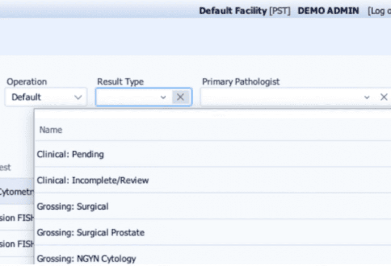
As part of this project, I conducted a full-language sweep across the platform to ensure consistency, accuracy, and alignment with the mental models uncovered in interviews. Beyond identifying broad patterns in language use, I also examined smaller UI elements for redundant or unclear phrasing.
For example, the label “Name” appeared in a dropdown where each option already clearly represented a result type, making the field title redundant and unnecessary. Adjustments like this were made to declutter the interface and reduce cognitive load, especially for users already navigating a high volume of case data.
This micro-level review worked in tandem with the broader content improvements to ensure the platform’s language felt intentional and intuitive at both the system and screen level.
Here’s an example of how I approach editing interface copy. After gathering insights from user interviews, I review screens with a focus on two things: aligning the language with clinicians’ preferences, and ensuring the overall writing supports a smoother, more intuitive experience. Below is one screen where I’ve added comments to walk through my thinking.

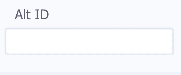


Alt ID
Alt ID
Based on user interviews, clinicians expressed frustration with seeing cases that were not yet actionable, especially those still in processing. The term “Accession” felt unclear and too technical for their day-to-day workflow. Changing the button label to “Ready for Review” better reflects their mental model and highlights only the cases that require immediate attention, reducing cognitive load and improving clarity.
I changed "alt ID" to “Alternative ID” to make it more understandable. Using the full term helps ensure there’s no confusion about what’s being asked. While "alt" might be familiar to some, spelling it out makes it more accessible for everyone, particularly those who might not be familiar with the abbreviation.
I changed “Editable” to “Set Priority” to make it clearer what the button does. Clinicians need to easily define or adjust the priority of a case, and “Set Priority” feels more direct and intuitive. This change helps users better understand the action they can take, making the process smoother and more straightforward.
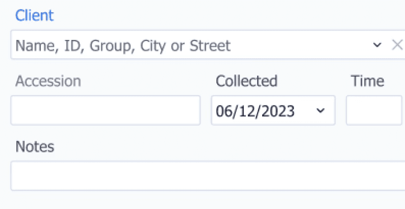
I swapped “Mobile Phone” for “Mobile Number” to make things clearer for users. It’s a more direct way of asking for exactly what we need — their mobile number. This small change helps avoid any confusion, especially for users who might have multiple numbers, and makes the whole process feel more straightforward.
Before:

After:
WORK
Due to NDA agreements and ongoing development, I’m unable to share final screens at this time. However, the examples above highlights my UX writing approach and how I incorporated user insights into the content decisions throughout the project.
You can explore more about the platform and view my UX writing by visiting the LigoLab website at LigoLab.com.
Want to connect?
Let’s discuss how I can contribute to bringing your user experience to a new level.
Contact me